Wander Buddy
Turning a three-minute sign-up into a 30-second first impression.
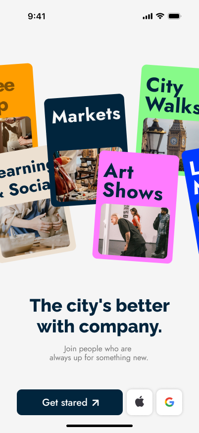
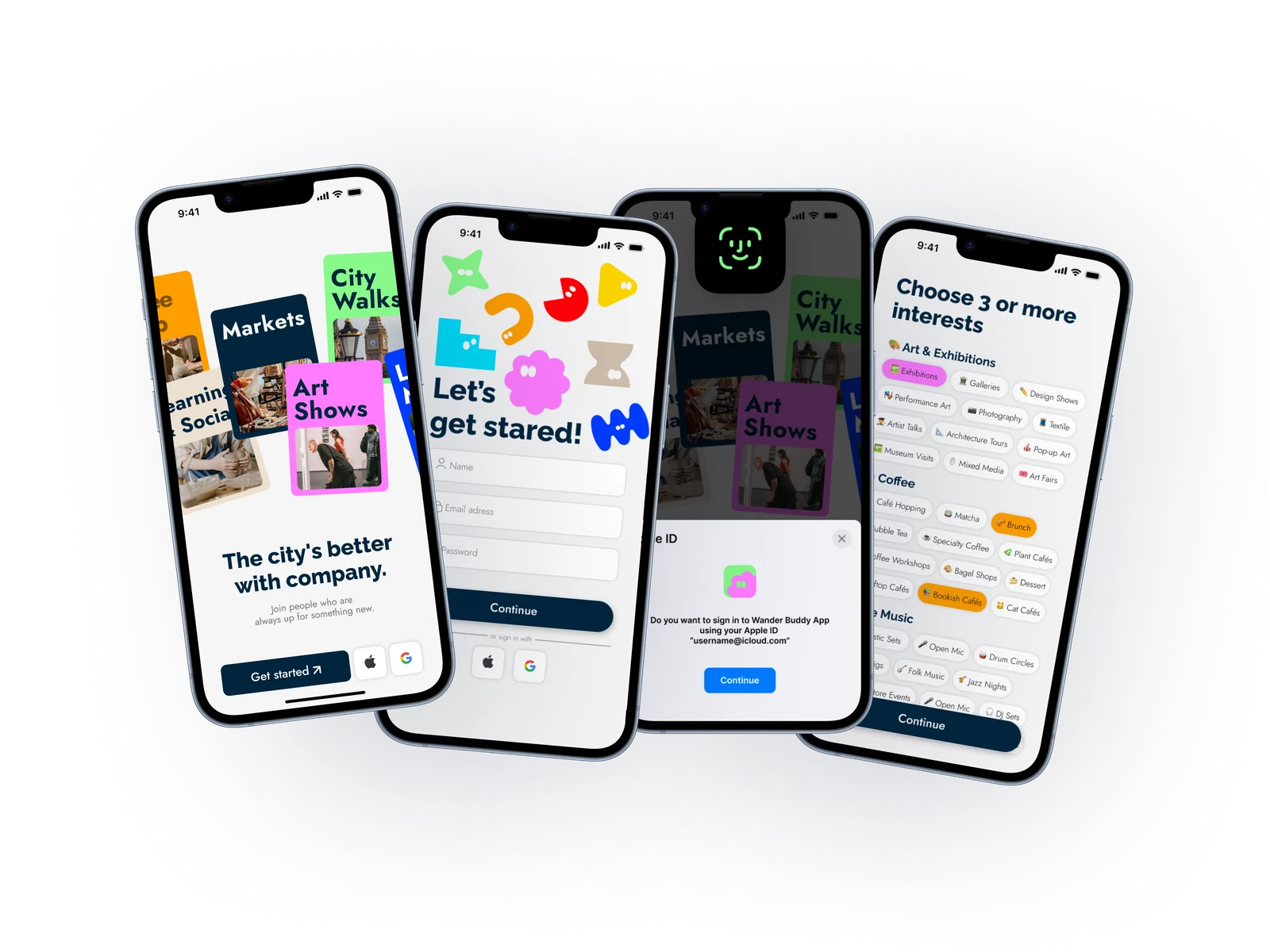
WanderBuddy connects newcomers, international students, and remote workers with companions for exploring the city. Most apps lose users at sign-up, too few options, too many fields. I designed a flow with three entry points and only the essentials: email, name, and interests, just enough to match people with the right activities from day one.
Design Challenge
Every question you ask is a reason for someone to leave.
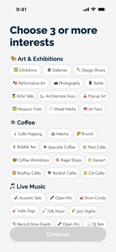
WanderBuddy needs to know what you're into before it can match you with anyone. The challenge was getting that without turning the front door into a form.
STRATEGY
Ask only what the algorithm needs
The recommendation engine needs three things: who you are, how to reach you, and what you're into. Photo, bio and location move to the profile page — filled in later, once the app has earned it. Sign-up became a gate to pass, not a form to complete.
THE USER
Let people pick their own fastest way in
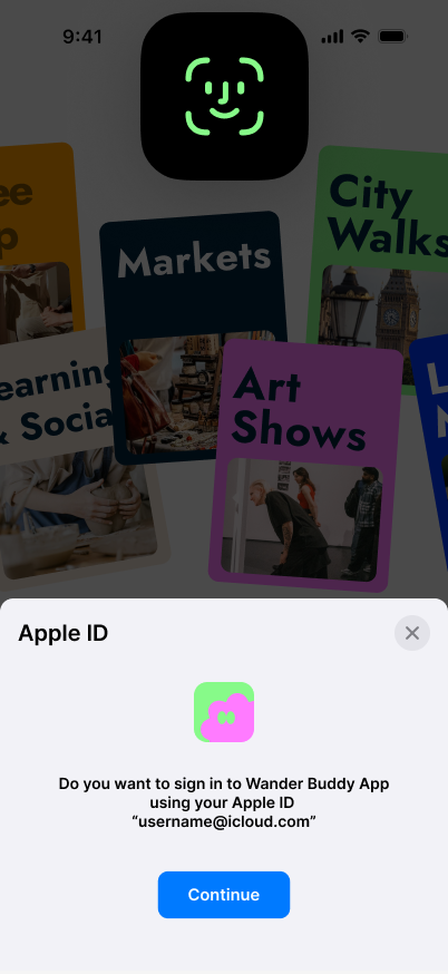
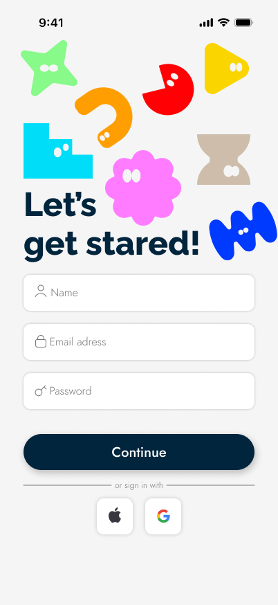
For someone who just landed in a new city, this is one of ten apps they downloaded that week. Trust is low and patience is lower. Apple, Google and email means nobody is forced through a password and a verification wait just to look around.
THE LOOK
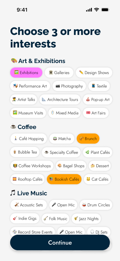
Make the last step feel like choosing, not filling
Eight categories, each with its own saturated color and simple character. On the final screen users aren't entering data, they're picking what they like. The palette does the brand's work too: this is an app about going out, and it should look like it.
BEFORE
Email only · 7 steps
AFTER
Three ways in · 3 steps
no password, no waiting
Sign up flow: Onboarding leads to three entry points — Sign in with Apple, Sign in with Google, or Email Register. Apple leads to System: Face ID Auth; Google leads to System: Google account Picker; Email Register leads to Verification Code. All three paths converge on the Interest Page, which leads to the Home Page.
Typography
Raleway
Raleway has clean, structured letterforms, making it well-suited for headlines that need strong visual presence
Jost
Jost carries a lighter, more rhythmic feel, making it ideal for subtitles and body text, giving the type hierarchy room to breathe without feeling heavy.
Color
Food/ Red
#FF0005
Coffee/ Orange
#FF9E00
Film/ Yellow
#FBD500
Outdoor/ Green
#87FA89
Market/ Blue
#00DDF9
Music/ Indigo
#003AFF
Exhibition/ Pink
#FF7BFF
Workshop/ Brown
#ECE0D1








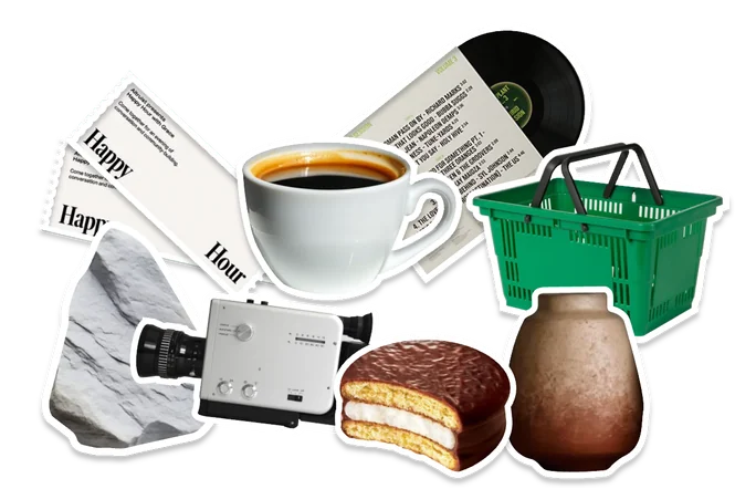
8 Activity Categories: Art & Exhibitions, Coffee & Cafés, Live Music, Markets, Outdoors, Film & Screenings, Food Exploration, Learning & Workshops. Each category is turned into 8 Characters — a simple shape, so users can recognize it at a glance.
Wander Buddy
Turning a three-minute sign-up into a 30-second first impression.