eHMS 2.0
An app nurses use to control a pressure-relief mattress.
eHMS 2.0
My first UI project, built inside an engineering team where no one had done UI before.
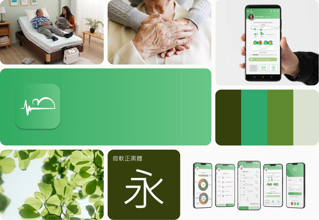
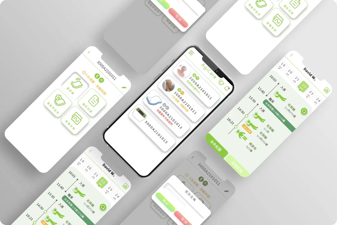
A phone app for eBio’s smart pressure-relief beds. Nurses and carers use it to control the bed, read lying records, and receive alerts.
01 OverviewWhat is this project?
This page is about how I learned to design an interface. eHMS was my first UI project. No one on the team had worked on UI before, including me, so we built the process as we went. Most of what follows is about the decisions I made, the ones I got wrong, and how I worked with engineers and a manager who had no design background.
eBio makes smart pressure-relief beds. People who stay in bed for long periods are prone to pressure ulcers. The main causes are poor circulation and sustained pressure on the sacrum, hips, shoulder blades and heels. The bed uses soft pressure sensors to map how a person is lying, finds the areas at risk, and moves the pressure away from them.
Before the app, the bed could only be operated from a unit at the bedside. There was one unit per bed and the screen was small. Nurses walked to each bed to read the data and change the mode. Family members and older carers had to memorise the steps. The company decided to move the controls onto a phone, so that one device could reach several beds.

Problems
One unit per bed, with a small screen. Nurses walked to each bedside to read data and change modes. The steps had to be memorised, which was hard for family members and older carers.

User
Nurses, care workers and family members. Nurses work fast and often with one hand. Family members are usually older and less familiar with apps.

Solution
The bed’s controls and records moved onto the phone. Users read lying data and alerts remotely, and manage several beds from one device.
My Role
I designed the app UI. The engineering lead decided how the pages connected, and I worked with two engineers on what could be built. I joined site visits and bed testing, and I also designed the user manual for the bed.
02 Design ChallengeWhat made this hard?
I started by reading the Android design guidelines, then tried to draw the screens myself. Starting from nothing was much harder than I expected, so I went looking for products to learn from. I could not find any. A phone app that controls a hospital bed has no obvious model, and I was not sure whether it should look like a remote control, a health app, or a clinical dashboard.
The product made this harder. The bed produces a lot of data and all of it matters for care. The home screen had to work as a remote control and as a status view at the same time, and the users range from nurses to family members.

Starting from zero
- No one on the team had designed an app before, including me. No one could say whether a design was right.
- I could not find a similar product to learn from.
- I put every style I liked into the app. The screens did not hold together.
- I set the first button sizes and spacing by eye, with no standard to point to.

One screen, too many jobs
- The home screen had to be a remote control and a status view at the same time.
- The bed reports posture, pressure distribution, current mode, cycle time, pressure relief level and connection status. All of it matters for care.
- Users range from nurses to family members, and there is one interface for all of them.
- The structure was set before I started. The first level listed the beds, and status sat one level down.
03 Design ProcessHow did we build it?
The company had no design process. We worked one out as we went, and the first attempt did not hold up.
Step 1 — Setting the constraints
My manager knew the customers. The beds go into long-term care homes, and the people using the app are often elderly. He asked for larger type and stronger contrast.
I turned that into something the team could build against: minimum type sizes, contrast ratios and touch target sizes, based on the Android design guidelines.
Step 2 — The first attempt
I read the Android guidelines and started drawing. Designing from nothing was harder than I expected, so I looked for similar products to work from. A phone app that controls a hospital bed had no obvious model, so I borrowed from any style I liked. The screens did not hold together.
The cost showed up in the work. Every small change reopened a discussion, and every new button was drawn from scratch.
Step 3 — Building a design system
I proposed a design system covering colour, type sizes, button styles and spacing. The engineers agreed straight away. Redrawing a button meant rewriting the code behind it, so we were paying for the same problem from two directions.
It took several rounds. I worked from published guidance, brought a version to the team, and revised it again.
Design System
Page 1 of 8: Type scale
Design system pages in full
- Primary buttons. Primary buttons. Columns: default, pressed, disabled. Primary, 320 × 45, radius 10, label 儲存至裝置. Secondary, 320 × 45, radius 10, label 下一步. Destructive, 320 × 45, radius 10, label 刪除使用者. Small primary, 160 × 40, label E-Mail驗證. Tokens: label 按鈕 22 pt; fill Green #6B8A47; outline Red #C26B52; disabled Pale grey #E1E1E1 with Light grey #A5A5A5 label.
- Control and dialog buttons. Control buttons. Columns: default, pressed, disabled. Start, 326 × 98, radius 20, label 開始 with a play glyph. Stop, 326 × 98, radius 20, label 停止 with a pause glyph. Tokens: stop fills with Green #6B8A47 so the running state reads at a glance; border Pale grey #E1E1E1. Dialog buttons. Pair, 147 × 45, radius 12, labels 取消 and 確定. Stacked, 295 × 45, radius 10, labels 取消 and 確定. Tokens: label 按鈕 22 pt; confirm Green #6B8A47; cancel Red #C26B52.
- Device card, timer, mode and menu. Device card and timer. Device card, 330 × 106, radius 10, showing a photo placeholder, device id 3000A2101011 and the status line 減壓模式運作中. Timer dropdown, 60分鐘. Disabled state not specified. Tokens: border Pale grey #E1E1E1; status line Grey #707070; connection icons Green #6B8A47. Mode and menu. Mode, 155 × 98, radius 20, label 循環週期. Menu, 130 × 130, radius 20, label 影像快照. Tokens: icon Green #6B8A47; border Pale grey #E1E1E1. How the scales are used. Type: 按鈕 22 pt for every button label; 標題2 23 pt for every dialog title; 標題1 32 pt for the login screen only. Colour: green for confirm, run and active icons; red for cancel and delete only; pale green for selected rows; pale grey for borders and disabled fills.
- Dialog sizes. Dialog sizes. Width is fixed at 335. Only the height changes. Every dialog sits centred horizontally and vertically. Small, 335 × 210, one field and two buttons, title 姓名. Medium, 335 × 290, a value picker and two buttons, title 體重 with values 69, 70 kg selected, 71. Large, 335 × 530, explanatory content and one button, title 降壓紀錄說明, showing a 顯示狀態 placeholder, 21% and 38%較佳減壓幅度, and the list 此頁面能顯示躺臥紀錄資訊: 1. 執行時間(正常執行時間為翻身或重心改變或智能護理循環週期)2. 躺臥姿勢 3. 上半身及下半身降壓幅度. Tokens: title 標題2 23 pt; confirm Green #6B8A47; cancel Red #C26B52; selected row Pale green #DAE2D1; divider Pale grey #E1E1E1.
- Dialog patterns. Dialog patterns. Text entry: title 修改名稱 with an input showing the placeholder 2802A2101011, and 取消 and 確定 buttons. Input is 300 × 50, radius 5. Text entry focused: the same dialog with the focus ring in the brand green. Selection: title 性別 with 男 as the selected row and 女 below, plus 取消 and 確定 buttons. The selected row uses pale green. Tokens: title 標題2 23 pt; focus ring Green #6B8A47; idle border Pale grey #E1E1E1; placeholder Light grey #A5A5A5; selected row Pale green #DAE2D1.
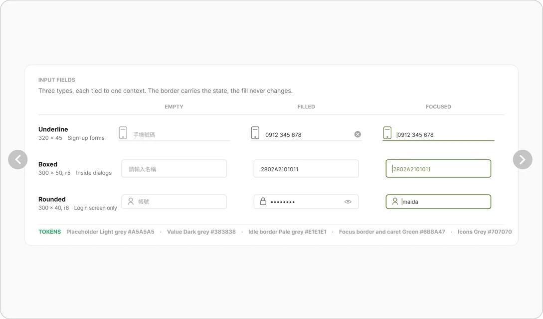
- Input fields. Input fields. Three types, each tied to one context. The border carries the state, the fill never changes. Columns: empty, filled, focused. Underline, 320 × 45, for sign-up forms, placeholder 手機號碼, filled value 0912 345 678. Boxed, 300 × 50, radius 5, inside dialogs, placeholder 請輸入名稱, filled value 2802A2101011. Rounded, 300 × 40, radius 6, login screen only, placeholder 帳號, filled with a masked password. Tokens: placeholder Light grey #A5A5A5; value Dark grey #383838; idle border Pale grey #E1E1E1; focus border and caret Green #6B8A47; icons Grey #707070.
Step 4 — Designing and iterating
The engineering lead defined how the pages connected. I designed the screens inside that structure.
Each round ran the same way. I took the designs to the two engineers to check what could be built, and we cut or simplified the interface animations that could not. Colleagues tried the build. Feedback from hospitals came back through the sales team and my manager. I went to a hospital once and watched doctors and nurses use it.
The app went through 20 versions.
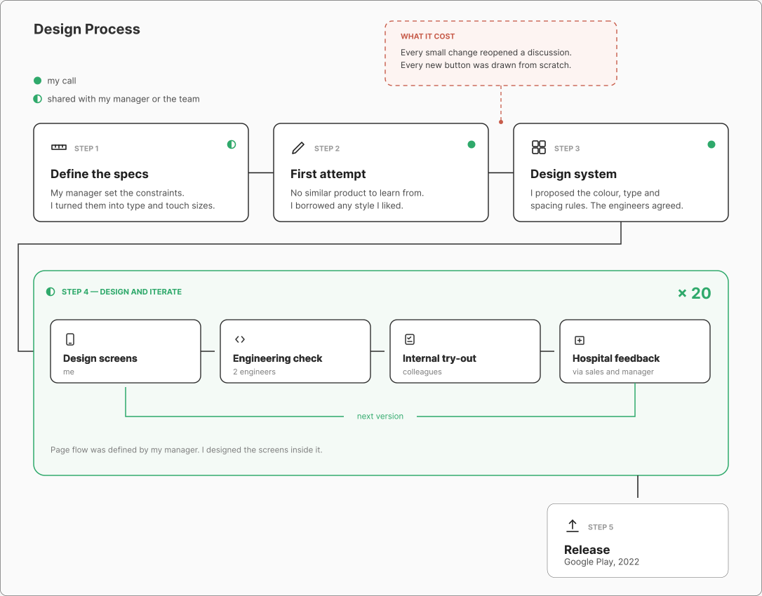
Design Process. Legend: a filled marker means my call; a half-filled marker means shared with my manager or the team.
What it cost: Every small change reopened a discussion. Every new button was drawn from scratch.
- Step 1, Define the specs. My manager set the constraints. I turned them into type and touch sizes.
- Step 2, First attempt. No similar product to learn from. I borrowed any style I liked.
- Step 3, Design system. I proposed the colour, type and spacing rules. The engineers agreed.
- Step 4, Design and iterate, repeated 20 times: Design screens (me) → Engineering check (2 engineers) → Internal try-out (colleagues) → Hospital feedback (via sales and manager) → next version. Page flow was defined by my manager. I designed the screens inside it.
- Step 5, Release. Google Play, 2022.
Key Features
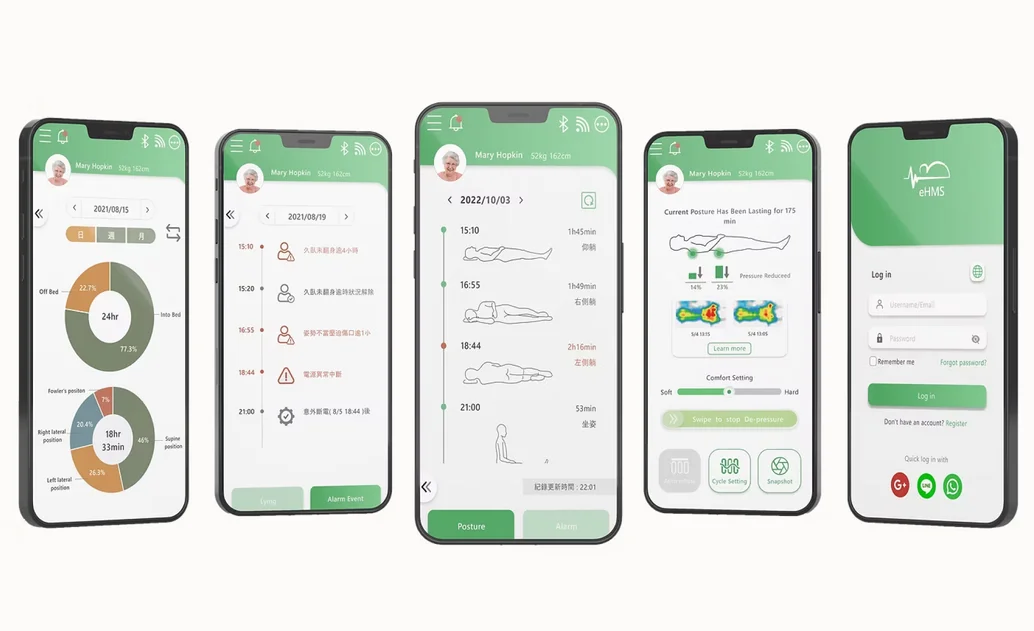
04 Key DecisionsWhat did I decide?
Putting the patient, not the device, on the home screen
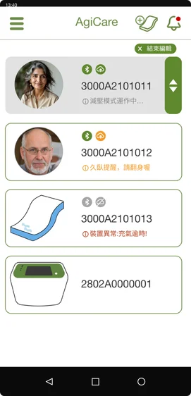
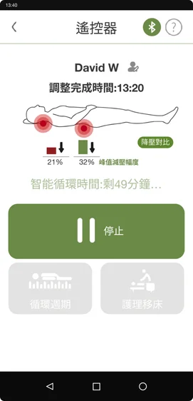
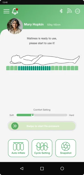
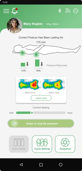
The sales team came back from a demo. Reaching the controls took one step too many, because the home screen opened on a list of beds. We talked it through and agreed the product was moving towards individual users rather than ward management. I proposed opening straight into the control screen for one bed. The home screen stopped being a list of equipment and became a view of one person.
Showing what the bed is doing, with animation
The massage function only had a static icon, so users could not tell whether the bed was running. I built six state animations in After Effects: posture detection, no one in bed, pressure redistribution, starting, back relief and hip relief. I had not used the software before and learned it for this. Feedback from sales demos, colleagues and nurses all pointed the same way. The state was easier to read.
A looping animation of the mattress control screen cycling through four states: no one in bed, starting, back pressure relief, and hip pressure relief. Each state shows the air cells under the body rising and falling, with the hip state also marking the pressure hotspot.
Sizing the interface for one-handed use
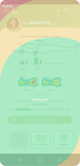
Nurses often use the app while holding something else, and many carers are elderly. I widened the buttons towards both edges of the screen and enlarged the connection status, moving it to the upper middle where it is seen first. I also moved the important controls into the area a thumb can reach. The sizes and contrast ratios came from the Android guidelines.
A proposal that was not used
Midway through I proposed a version in the Neumorphism style, with soft shadows, embossed components and a brighter palette. My manager turned it down. The company sells into traditional care settings, and he thought the style would feel distant to those users. He was right. Neumorphism uses low-contrast shadow to define the edge of a component, while I was enlarging controls and raising contrast at the same time. For elderly users, low contrast decides whether they can see a control at all.
05 What I LearnedI was the most junior person in the room, so I brought screens instead of explanations.
Most problems came to me from other people. Ideas alone did not carry much weight when they came from me, so I changed the form my answer took.
- I brought screens to meetings instead of descriptions
- I showed several versions rather than one recommendation
- I turned vague feedback into numbers the team could build against
- I proposed a design system
Not everyone on the team thinks visually. A screen at eighty per cent is easier to react to than a description, and it gave people something to disagree with. I did not invent any of this. I read about design systems before I proposed one, and what I contributed was bringing the practice into a team that had never worked that way.
The engineers agreed to it straight away, because redrawing a button meant rewriting their code.
06 TodayWhat would I do now?
I spent a lot of that year polishing details, and that part mattered. But I pushed just as hard on every one of them. When everything is defended equally, nothing reads as important, and nobody on the team could tell where my standard actually was.
I would now pick a few things to hold firm on and let the rest go. I would also listen sooner. The engineers and my manager had worked on this product for years, and some of what I argued against was not a matter of taste. It was something they already knew and I did not.
The insisting also had a cost I was not counting at the time. It slowed the schedule, and it made more work for the people around me.
07 OutcomeWhere did it go?
The product reached hospitals, care homes and retail. Parts of what I made are still in service.
Where the product went
- Hospital wards and long-term care homes
- Sold through a national medical supply retail chain in Taiwan
- Product awards in 2021 and 2023, including the Ministry of Economic Affairs’ evaluation of assistive products for older and disabled users
What is still in use
- The 22-page user manual. I wrote and laid it out: safety notices, installation, the fault code table and the CPR release procedure. Still published on the company site.
- The Agicare logo
- The app icon